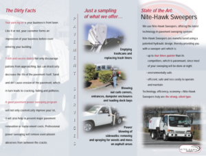
It doesn’t matter what your industry, a well crafted brochure is essential for your small business marketing. Not only do brochures let you showcase your business—your products or services and your purpose, but they’re also a key resource for targeting clients offline.
Unfortunately, simply knowing the potential value of a brochure isn’t enough to make sure it’s effective, so we’ve offered a couple of downloadable examples as well as these tips:
Think Strategically.
A brochure that communicates effectively doesn’t happen by accident—it requires planning and foresight. So to start the design process, ask yourself, how do we want people to use the brochure? What do we want them to DO after they read it? What do we want them to REMEMBER? Your brochure should have a specific purpose, whether that’s:
• Informational: To give when clients ask about your company or product
• Supplemental: To leave with clients after a meting or sales pitch
• Point of Sale: Available for clients to read in-person or at your office
• Direct Mail: Sent to prospects as part of mail marketing campaign
• Sales Support: To aid in sales pitch or presentation
Focus Your Goals.
A brochure with too many goals—say, to sell people on the company, sell people on the products, describe features, give details of huge product lines, etc.—comes across as confusing and unmemorable. Pushing too many messages is the surest way to communicate none. Choose instead to target the purpose of your brochure one just one, maybe two, goals.
Identify Your Target Audience.
Who is your brochure for? What tone and style would appeal to them? It’s vital that you know who you’re writing to because, as an article from Top Design Mag instructs, you want to “use an appropriate language for the target audience and give them exactly what they want to know. If for example the brochure is dedicated to children, [it] is not recommended to use a very complicated vocabulary or a trivial font. Try to send the message through images and colors.”


